
This map above shows the likelihood of counties across the nation that are inclined to not mail back their 2010 Census forms. This obviously causes a problem because the federal government will not know how much representation and funding every county needs. The source of this map is the US Census Bureau, but the map was obtained from the website of USA Today. Counties that have a darker shade of blue are least likely to return the 2010 Census form. It is interesting to note that many of the darkest blue counties are clustered mainly in the south and the west (including Alaska and Hawaii). At first glance it would seem logical that a majority of people living in the US, if not everyone, would send their forms back. Unfortunately, that is not the case for many counties. One explanation that may account for the dark clusters around the south and the west is the huge populations of immigrants who do not know how to speak English. English-speaking ability is a factor of whether or not the Census forms are mailed back.

The second map shown above is more of a comical, informal map. The informality of this map is further realized by the fact that the source of this map is a Tumblr of a person named Ilya Gerner. In this map, the creator ascribes to each state its most notable characteristic, probably taking on both a national and personal perspective of each state. Each characteristic widely varies from state to state - the topics range from personal (Oregon, most breastfed babies) to society (New Hampshire, least poverty) to everything else in between. A national perspective can be seen in this map. For instance, it reflects the national perspective of the nature of the Bible Belt in the South (Mississippi, churches per capita; Alabama, church attendance). Michigan obviously borders the Great Lakes and undoubtedly draws from them (Michigan, best freshwater access). Putting the national perspective aside, some of the characteristics are very trivial. Who would have ever known that Ohioans frequented their libraries so often (Ohio, highest library usage)? Or who would ever have known that South Carolina apparently has many golf courses (South Carolina, golf holes per capita)? This map is very interesting because it displays facts that are not commonly associated with certain states.
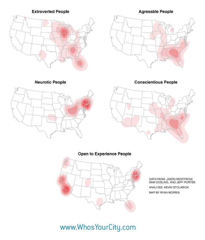
This set of five maps includes interesting maps that show where different types of people are concentrated within the contiguous 48 states. The different types are extroverted people, agreeable people, neurotic people, conscientious people, and people who are open to experience. The source of the maps is a website that is named "Who's Your City?" and was created by a person named Richard Florida. According to these maps, extroverted people are concentrated within a 100-mile radius of Chicago, agreeable people within the South, neurotic people within the northeast, conscientious people within the South, and people who are open to experience within a 100-mile radius of Los Angeles and New York City. It is strange to find the most extroverted people in America to be concentrated within the Chicago area. What may be less strange is the fact that the people who are open to experience are concentrated within Los Angeles and New York City. Perhaps the reason is that both cities are big and diverse in nature and offer many opportunities for work and volunteer projects. As mentioned in the second map, the Bible Belt is prevalent in the South, and this may account for the fact that many conscientious people are clustered there. They probably have a diligent work ethic where they live. These maps can be useful for new and current companies seeking to hire people who are willing to be creative, work hard, and try new things. The success of a company may very well depend on where it is located. A CEO may ask himself, "Is this location X full of creative people who are open to get as much experience as possible?"
No comments:
Post a Comment