Here is my map of the famous Parisian landmarks visitors to the city would most likely go to.
View
Neogeography has a lot of potential. User-generated maps are becoming very popular because they are from the people themselves! The average internet user is able to post up, on Google Maps for example, the places he has been to, pictures of them, suggested routes to avoid heavy traffic, and many other types of information. User-generated content creates a type of community trust within users as they peruse the wealth of information given by many people just like themselves. Since the information comes from the users themselves, it can be seen as reliable and a first-hand account of what actually happens around a certain area - there is no medium through which the information has to be examined. Mashups can also be beneficial to those who love finding places that the majority of people do not know about. In addition to photos, users can also provide videos of a certain area. This can definitely help people in the sphere of obtaining information from maps - the people will be able to, for example, familiarize themselves with an area before going there. They will already have an expectation on what a place is going to look like because they have seen the uploaded images generated by other users who have already gone there.
On the negative side, neogeography certainly does have its pitfalls. Since the content being put into the mashups is not screened for accuracy, users can post incorrect and misleading information that can confuse others, whether or not it was intentional. Another disadvantage for neogeography is that all of the necessary information may not be shown in any given mashup. In a certain area that a person would like to go to, it may be the case that not very many people have visited it and documented the place with pictures and video. That person is at a disadvantage because he is not able to plan his route accordingly. If he had access to a map that was created by an official mapping agency, he would most likely be able to circumvent the lack of information in other mashups by relying on what the official map says.
Thursday, April 26, 2012
Thursday, April 19, 2012
Beverly Hills Topographic Map Questions
The name of the quadrangle is "Beverly Hills Quadrangle."
2. What are the names of the adjacent quadrangles?
The names of the adjacent quadrangles are "Canoga Park," "Van Nuys," "Burbank," "Topanga," "Hollywood," "Venice," and "Inglewood." There is one other quadrangle in the southwest corner, but that is the Pacific Ocean.
3. When was the quadrangle first created?
The quadrangle was first created in 1995.
4. What datum was used to create your map?
The datum that was used to create the map was the North American Datum of 1983.
5. What is the scale of the map?
The scale of the map is 1:24,000.
6. At the above scale, answer the following:
a) 5 centimeters on the map is equivalent to how many meters on the ground?
5 centimeters on the map is equivalent to 1,200 meters on the ground.
b) 5 inches on the map is equivalent to how many miles on the ground?
5 inches on the map is equivalent to about 1.89 miles on the ground.
c) one mile on the ground is equivalent to how many inches on the map?
One mile on the ground is equivalent to 2.64 inches on the map.
d) three kilometers on the ground is equivalent to how many centimeters on the map?
Three kilometers on the ground is equivalent to 12.5 centimeters.
7. What is the contour interval on your map?
The contour interval is 20 feet.
8. What are the approximate geographic coordinates in both degrees/minutes/seconds and decimal degrees of:
a) the Public Affairs Building
34º04'23" N, 118º26'18" W
34.07 N, 118.44 W
b) the tip of Santa Monica Pier
34º00'35" N, 118º29'58" W
34.01 N, 118.50 W
c) the Upper Franklin Canyon Reservoir
34º07'11" N, 118º23'54" W
34.12 N, 118.40 W
9. What is the approximate elevation in both feet and meters of:
a) Greystone Mansion (in Greystone Park)
560 ft, 170.69 meters
b) Woodlawn Cemetery
140 ft, 42.67 meters
c) Crestwood Hills Park
720 ft, 219.46 meters
10. What is the UTM zone of the map?
The UTM zone is Zone 11.
11. What are the UTM coordinates for the lower left corner of your map?
The UTM coordinates are (362000m E, 3763000m N)
12. How many square meters are contained within each cell (square) of the UTM gridlines?
Each cell is 1,000,000 square meters.
13. Obtain elevation measurements, from west to east along the UTM northing 3771000, where the eastings of the UTM grid intersect the northing. Create an elevation profile using these measurements in Excel (hint: create a line chart). Figure out how to label the elevation values to the two measurements on campus. Insert your elevation profile as a graphic in your blog.

The bold numbers represent the UTM northing 3771000 elevations at the UCLA campus.
14. What is the magnetic declination of the map?
The magnetic declination is 14º.
15. In which direction does water flow in the intermittent stream between the 405 freeway and Stone Canyon Reservoir?
The water flows south.
16. Crop out (i.e., cut and paste) UCLA from the map and include it as a graphic on your blog.

Thursday, April 5, 2012
Maps That You May Have Never Seen Before

This map above shows the likelihood of counties across the nation that are inclined to not mail back their 2010 Census forms. This obviously causes a problem because the federal government will not know how much representation and funding every county needs. The source of this map is the US Census Bureau, but the map was obtained from the website of USA Today. Counties that have a darker shade of blue are least likely to return the 2010 Census form. It is interesting to note that many of the darkest blue counties are clustered mainly in the south and the west (including Alaska and Hawaii). At first glance it would seem logical that a majority of people living in the US, if not everyone, would send their forms back. Unfortunately, that is not the case for many counties. One explanation that may account for the dark clusters around the south and the west is the huge populations of immigrants who do not know how to speak English. English-speaking ability is a factor of whether or not the Census forms are mailed back.

The second map shown above is more of a comical, informal map. The informality of this map is further realized by the fact that the source of this map is a Tumblr of a person named Ilya Gerner. In this map, the creator ascribes to each state its most notable characteristic, probably taking on both a national and personal perspective of each state. Each characteristic widely varies from state to state - the topics range from personal (Oregon, most breastfed babies) to society (New Hampshire, least poverty) to everything else in between. A national perspective can be seen in this map. For instance, it reflects the national perspective of the nature of the Bible Belt in the South (Mississippi, churches per capita; Alabama, church attendance). Michigan obviously borders the Great Lakes and undoubtedly draws from them (Michigan, best freshwater access). Putting the national perspective aside, some of the characteristics are very trivial. Who would have ever known that Ohioans frequented their libraries so often (Ohio, highest library usage)? Or who would ever have known that South Carolina apparently has many golf courses (South Carolina, golf holes per capita)? This map is very interesting because it displays facts that are not commonly associated with certain states.
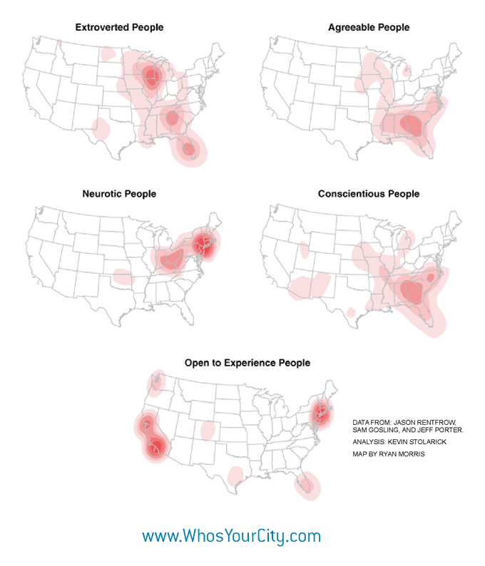
This set of five maps includes interesting maps that show where different types of people are concentrated within the contiguous 48 states. The different types are extroverted people, agreeable people, neurotic people, conscientious people, and people who are open to experience. The source of the maps is a website that is named "Who's Your City?" and was created by a person named Richard Florida. According to these maps, extroverted people are concentrated within a 100-mile radius of Chicago, agreeable people within the South, neurotic people within the northeast, conscientious people within the South, and people who are open to experience within a 100-mile radius of Los Angeles and New York City. It is strange to find the most extroverted people in America to be concentrated within the Chicago area. What may be less strange is the fact that the people who are open to experience are concentrated within Los Angeles and New York City. Perhaps the reason is that both cities are big and diverse in nature and offer many opportunities for work and volunteer projects. As mentioned in the second map, the Bible Belt is prevalent in the South, and this may account for the fact that many conscientious people are clustered there. They probably have a diligent work ethic where they live. These maps can be useful for new and current companies seeking to hire people who are willing to be creative, work hard, and try new things. The success of a company may very well depend on where it is located. A CEO may ask himself, "Is this location X full of creative people who are open to get as much experience as possible?"
Subscribe to:
Comments (Atom)